Digital Diatribes

A presentation of data on climate and other stuff

The Best of Digital Diatribes (In one man’s opinion…)

Posted by The Diatribe Guy on July 15, 2010

Over the course of my time here, there seem to be a handful of posts that I keep referring to. These posts are referred to because of other studies that arise, or questions that come up.

I don’t consider my blog to, for the most part, have provided a plethora of new information to the discussion on climate, climate change, or the science behind the data. Most of my posts on the subject are more of a curiosity. “Hey, here’s a bunch of data. Here’s a bunch of trends at different lengths. Here’s how those trends are changing.” Most people with an understanding of Excel and statistics could do something similar. I guess maybe others aren’t as interested to just look through a bunch of numbers to see if any interesting things jump out, so to the extent I’ve been able to add something, that’s great.

There have been times, though, where I do an analysis and put together a post that I’m particularly proud of. I believe it actually does add to the debate.

Interestingly, those more complex posts with an actual interesting conclusion seem to get less attention than a simple trend line chart. I continue to be astonished by the debates that can ensue over a simple line chart.

But nevertheless, since there are a few posts that (a) I really like, (b) refer to quite a bit – and every time I do I have to dig through and remember where it is, and (c) I think actually add a new insight to the debate, I thought I’d highlight these posts again, while putting them all into one post.

So, with that introduction, here they are:
(1) Sunspot study that derives a correlation between sunspots and temperature

(2) A best fit of sine waves to HadCrut data that clearly shows cycles within the temperature data

(3) A look at the AMO data, demonstrating where we are in the current cycle, and where we’re headed

(4) A look at a few ocean cycles, but the focus here is the PDO analysis

(5) A demonstration of the fallacy of a singular trend-line fit in the recent temperature data, and how most of the increase in temps has come from a single step

Posted in Climate Change, Cycles, Data, Earth, Global Warming, Information, Oceans, Science, Temperature Analysis | 10 Comments »

Forex Account Update as of 6/30/2012

Posted by The Diatribe Guy on July 6, 2012

Account update as of 6/30/2012

OUTSTANDING ORDERS as of End of Day 05/31/2012 settled by End of Day 06/30/2012
Date of entry / Type of Entry / Lot size / Currency Pair / Entry Price / Date of Settlement / Exit Price / Net Profit*
01/03/2012 BUY 0.01 usdcnh 6.31580 06/25/2012 6.37604 -0.59

There was also a “swap revision” this month that amounted to -0.57

*Net profit means profit after consideration of swap fees (these can be negative or positive)

New Orders since End of Day 05/31/2012, settled by end of day 06/30/2012
Date of entry / Type of Entry / Lot size / Currency Pair / Entry Price / Date of Settlement / Exit Price / Net Profit
06/01/2012 SELL 0.02 gbpjpy 119.766 06/01/2012 119.364 +10.30
06/04/2012 BUY 0.02 audcad 1.01141 06/06/2012 1.01734 +11.74
06/12/2012 SELL 0.02 audnzd 1.27850 06/25/2012 1.27112 +10.47
06/18/2012 SELL 0.02 euraud 1.24571 06/26/2012 1.24135 +10.45

New Orders Since end of day 05/31/2012, still outstanding as of end of day 06/30/2012
Date of entry / Type of entry / Currency Pair / Lot size / Entry price
06/01/2012 SELL 0.02 gbpusd 1.53097
06/04/2012 SELL 0.02 usdhkd 7.75812
06/21/2012 BUY 0.02 audjpy 81.551
06/26/2012 SELL 0.02 eurgbp 0.79831
06/29/2012 SELL 0.02 usdmxn 13.3988

Carried Orders Since before end of day 05/31/2012, still outstanding as of end of day 06/30/2012
Date of entry / Type of entry / Currency Pair / Lot size / Entry price
08/04/2011 SELL 0.01 usdcad 0.96454
08/04/2011 SELL 0.01 usdmxn 11.8786
08/08/2011 SELL 0.01 usdmxn 12.1198
09/06/2011 SELL 0.01 usdchf 0.82308
09/08/2012 SELL 0.01 usdchf 0.86223
12/07/2011 BUY 0.01 eurgbp 0.85187
12/20/2011 BUY 0.01 euraud 1.29814
01/05/2012 BUY 0.01 usdhkd 7.76620
01/09/2012 BUY 0.01 audnzd 1.30351
01/09/2012 BUY 0.01 usdtry 1.8710
01/09/2012 SELL 0.01 eurchf 1.21285
02/14/2012 SELL 0.01 usdjpy 77.798
03/14/2012 BUY 0.01 eurchf 1.21465
04/25/2012 SELL 0.02 eurchf 1.20110
04/27/2012 SELL 0.02 usdchf 0.90502
05/17/2012 SELL 0.02 usdcnh 0.90502
05/18/2012 BUY 0.02 eurtry 2.35131
05/22/2012 BUY 0.02 audnzd 1.30114
05/25/2012 SELL 0.02 eurgbp 0.79843
05/25/2012 SELL 0.02 eurchf 1.20050

Equity Balance @ 06/30/2012: $4,345.89
Current Month Return: -0.070%
Initial 10/31/2009 balance: $2,360.46
Current Yield since inception: +84.113%
Annualized Return: +25.731%
Average monthly return: +1.926%

11/1/2009 – 7/31/2010: +89.71%
8/1/2010 – 10/17/2010 (the date at which point I ceased the short strategy and liquidated positions): -34.35%
10/18/2010 – 12/31/2010: +11.94%
1/1/2011 – 1/31/2011: -7.23%
2/1/2011 – 8/31/2011: +29.80%
9/1/2011 – 9/30/2011: -20.68%
10/1/2011 – 11/30/2011: +27.34%
12/1/2011 – 12/31/2011: -5.06%
01/1/2012 – 01/31/2012: +8.15%
02/1/2012 – 02/29/2012: -5.749%
03/01/2012 – 05/31/2012: +12.275%
06/01/2012 – 06/30/2012: -0.070%

Journal Notes:
Received an interesting e-mail from the brokerage where I place my trades on 6/15. Making it clear that they offer no trading advice, they nevertheless gave the heads up on the Greek Parliamentary vote on the following Sunday. It was just a statement of potential volatility in the market to come, so it was a reminder for people to assess exposure so they can make sure they have stop losses in tow, close any overexposed positions, etc.

I can’t remember getting that kind of heads-up e-mail before.

I’m a fan of volatility. Even with short-term losses, I usually pick up extra positions that bounce the other way before too long and I find volatility to be good profit opportunities, so I made no changes to my trading strategy. As it turns out, the result of the elections was such that the excessive volatility never materialized. In fact, June was an overall quiet month.

Posted in Currency Trading, Forex, Gold, Investing, Trading Strategies | Tagged: , , , , | Leave a Comment »

Forex Account Update as of 5/31/2012

Posted by The Diatribe Guy on May 31, 2012

Account update as of 5/31/2012

OUTSTANDING ORDERS as of End of Day 04/30/2012 settled by End of Day 05/31/2012
Date of entry / Type of Entry / Lot size / Currency Pair / Entry Price / Date of Settlement / Exit Price / Net Profit
04/23/2012 SELL 0.02 eurgbp 0.81558 05/02/2012 0.81220 +10.98
04/25/2012 SELL 0.02 eurcad 1.30131 05/03/2012 1.29842 +5.87
04/10/2012 SELL 0.01 cadjpy 80.476 05/08/2012 79.970 +5.19
03/13/2012 SELL 0.02 eurcad 1.29446 05/11/2012 1.28881 +12.55
03/23/2012 BUY 0.01 usdcad 1.00245 05/16/2012 1.00950 +5.10
02/08/2012 SELL 0.01 eurjpy 102.192 05/17/2012 101.488 +6.41
01/20/2012 SELL 0.01 audjpy 80.768 05/17/2012 79.182 +1.76
04/30/2012 SELL 0.02 usdjpy 79.846 05/17/2012 79.387 +10.81
02/07/2012 SELL 0.01 chfjpy 84.072 05/23/2012 83.548 +6.60
02/08/2012 SELL 0.01 cadjpy 77.562 05/30/2012 76.761 +5.64
02/07/2012 SELL 0.01 gbpjpy 121.973 05/31/2012 120.972 +8.80
04/27/2012 SELL 0.02 euraud 1.27019 05/31/2012 1.26882 +10.58

*Net profit means profit after consideration of swap fees (these can be negative or positive)

New Orders since End of Day 04/30/2012, settled by end of day 05/31/2012
Date of entry / Type of Entry / Lot size / Currency Pair / Entry Price / Date of Settlement / Exit Price / Net Profit
05/02/2012 SELL 0.02 eurgbp 0.81365 05/03/2012 0.81227 +4.47
05/07/2012 SELL 0.02 eurgbp 0.80613 05/09/2012 0.80330 +9.12
05/14/2012 BUY 0.02 usdmxn 13.6085 05/14/2012 13.6802 +10.48
05/14/2012 SELL 0.02 eurusd 1.28823 05/14/2012 1.28323 +10.00
05/14/2012 BUY 0.02 usdtry 1.8083 05/15/2012 1.8227 +14.88
05/16/2012 SELL 0.02 gbpusd 1.59689 05/16/2012 1.59188 +10.02
05/17/2012 SELL 0.02 eurjpy 101.805 05/17/2012 101.494 +7.79
05/17/2012 SELL 0.02 audjpy 78.464 05/21/2012 78.029 +10.48
05/18/2012 SELL 0.02 nzdusd 0.75483 05/23/2012 0.74961 +9.98
05/28/2012 SELL 0.02 eurcad 1.28481 05/29/2012 1.27951 +10.34
05/30/2012 SELL 0.02 chfjpy 82.141 05/30/2012 81.715 +10.79
05/23/2012 BUY 0.02 usdmxn 14.0397 05/30/2012 14.1477 +13.22
05/30/2012 SELL 0.02 cadjpy 76.607 05/31/2012 76.010 +14.81
05/31/2012 SELL 0.02 eurjpy 97.666 05/31/2012 97.162 +12.83

New Orders Since end of day 04/30/2012, still outstanding as of end of day 05/31/2012
Date of entry / Type of entry / Currency Pair / Lot size / Entry price
05/17/2012 SELL 0.02 usdcnh 0.90502
05/18/2012 BUY 0.02 eurtry 2.35131
05/22/2012 BUY 0.02 audnzd 1.30114
05/25/2012 SELL 0.02 eurgbp 0.79843
05/25/2012 SELL 0.02 eurchf 1.20050

Carried Orders Since before end of day 04/30/2012, still outstanding as of end of day 05/31/2012
Date of entry / Type of entry / Currency Pair / Lot size / Entry price
08/04/2011 SELL 0.01 usdcad 0.96454
08/04/2011 SELL 0.01 usdmxn 11.8786
08/08/2011 SELL 0.01 usdmxn 12.1198
09/06/2011 SELL 0.01 usdchf 0.82308
09/08/2012 SELL 0.01 usdchf 0.86223
12/07/2011 BUY 0.01 eurgbp 0.85187
12/20/2011 BUY 0.01 euraud 1.29814
01/03/2012 BUY 0.01 usdcnh 6.31580
01/05/2012 BUY 0.01 usdhkd 7.76620
01/09/2012 BUY 0.01 audnzd 1.30351
01/09/2012 BUY 0.01 usdtry 1.8710
01/09/2012 SELL 0.01 eurchf 1.21285
02/14/2012 SELL 0.01 usdjpy 77.798
03/14/2012 BUY 0.01 eurchf 1.21465
04/25/2012 SELL 0.02 eurchf 1.20110
04/27/2012 SELL 0.02 usdchf 0.90502

Equity Balance @ 05/31/2012: $4,348.92
Current Month Return: 1.604%
Initial 10/31/2009 balance: $2,360.46
Current Yield since inception: +84.240%
Annualized Return: +26.684%
Average monthly return: +1.958%

11/1/2009 – 7/31/2010: +89.71%
8/1/2010 – 10/17/2010 (the date at which point I ceased the short strategy and liquidated positions): -34.35%
10/18/2010 – 12/31/2010: +11.94%
1/1/2011 – 1/31/2011: -7.23%
2/1/2011 – 8/31/2011: +29.80%
9/1/2011 – 9/30/2011: -20.68%
10/1/2011 – 11/30/2011: +27.34%
12/1/2011 – 12/31/2011: -5.06%
01/1/2012 – 01/31/2012: +8.15%
02/1/2012 – 02/29/2012: -5.749%
03/01/2012 – 05/31/2012: +12.275%

Journal Notes:

Posted in Currency Trading, Forex, Gold, Investing, Trading Strategies | Tagged: , , , , | Leave a Comment »

The Embarrassment That is the Allianz Climate Change Report

Posted by The Diatribe Guy on May 30, 2012

I am an actuary in the insurance industry, and so receive information of all sorts that are supposed to enlighten me and assist me in my job.   Whether it is a better model to use in forecasting future experience based on current trends for the purpose of pricing products, or accurate assessment of ultimate losses on current inforce products, it is imperative that I understand new advancements in predictive modeling, underlying trends, and results of different studies to most benefit my company and the customers we serve.

In this capacity, I recently came across a 97 page effort by Allianz, in partnership with – get this – the WWF (World Wide Fund for Nature), entitled “Major Tipping Points in the Earth’s Climate System and Consequences of the Insurance Sector.”   As someone who wants to base pricing considerations on observed experience and modeled trends, I was curious about this paper, and how it is implied that this is to be used by the insurance industry.   The report isn’t a new one, but it was  the first I had run across it.

The very first line of the paper reads:  “Climate change resulting from emissions of CO2 and other greenhouse gases (GHGs) is widely regarded to be the greatest environmental challenge facing the world today.”


Ominous.


Page one teaches us some interesting details.   I learned that there is no global agreement or scientific consensus for delineating ‘dangerous’ from ‘acceptable’ climate change, but 2 degrees Celsius seems like a good number.   The origin of that 2 degree number is not clear, but seems to be promoted based on the UNFCCC Assessment Report (AR4).


We then learn about tipping points.   The theory here is that, while temperature may increase gradually, there are points where a small change can make a big difference in the system.  The cited reference here is M. Gladwell, “The Tipping Point: How Little Things Can Make a Big Difference.”    It is unclear to me if this is a how-to book on marriage, or something spelling out the global catastrophes to come, but apparently it’s good enough for the reinsurance industry.


Well, anyway, this is just the Executive Summary, which includes examples of Tipping Points.   It appears we are talking about disasters such as effects of rise in sea levels, a shift in monsoon seasons, Amazon drought, and an overly arid Southwest U.S.   No mention of comets or alien attack, so I guess we’re sticking to “things we can control.”


There is then a touching “Take Home Message” to conclude the Executive Summary.   We learn that past emissions have already committed us to at least 0.6 degrees of further warming.   Because we’re lazy and lackluster in our efforts to combat it, the 2-3 degrees scenario is almost certain to happen.


Ominous.


I must say, as I read the actual body of the document, I was pretty disappointed with my reinsurance brothers and sisters.    We start with simply references to other works, clearly fed to them by WWF and other environmentalist groups.    UN studies, IPCC papers, etc. tell us there will not be a smooth transition into warmer temperatures.  This leads into the definitions and characteristics of tipping points, which – let’s be honest – insurance people will not know whether the studies they are reading are right or wrong.   They’re insurance people.  But in any case, it doesn’t appear that there was a serious attempt to reach out to alternative opinons on the matter.   Nobody called me, which can be expected.   More importantly, I don’t think Dr. Roy Spencer got a call either.   I don’t even think Jeff from the Air Vent was consulted.   A travesty.


Section 2 focuses on identifying tipping elements based on IPCC AR4.  

On a serious note, from a reinsurance standpoint, the things they are looking at need to be considered for the purpose of understanding exposure to risk.   What kind of storm activity tends to occur with changes in the ENSO amplitude?   What is the exposure in the event of differences in monsoon activity around the globe?   What are the insurance impacts to glaciers melting? What are the impacts of this event or that event?   All legitimate questions to make sure the company can sustain viability should certain things occur that impact loss payouts.   The issue I have here is putting such study in a document that doesn’t just use global warming theory as a “what if” scenario, but presents it as a given.


We then get into all sorts of scenarios around different tipping points.   It’s all the same stuff: Greenland, Arctic Ice, sea level rises, the Antarctic, carbon stores in permafrost (amplified global warming, you know), and so on.   Then, we get into tipping points that can tip other points, or something like that.


Section 3 highlights the greatest risks to our dismal future.  


So, what am I most disappointed in?   My disappointment is mainly that this is a piece of propaganda disguised as an insurance study.   If it is an insurance study, it’s a horrible one, and I’d fire anyone who resented it to me as a definitive assessment.   I see no industry experience and actual trends presented.   It is a “study” in the sense that it covers a lot of “what if” scenarios, which is an entirely legitimate exercise, but it provides them as a near certainty as opposed to a random probabilistic event.   Oh, sure, there are a lot of graphs and charts that lead one to believe that this is a rigorous study, but it is not.    It is a study that has, at its basis, a complete trust in the views and conclusions of a few UN-sponsored reports and other data that is derived in its entirety from the pro-AGW side.   It reeks of being a UN lapdog in anticipation of taking advantage of climate change scenarios and scare tactics for a lining of the pockets and future power grab.  


The study into the “what-ifs” seems pretty sound.    This part is fine, which is what I would expect from experts in the reinsurance industry, because this is what they do: they assess exposures, risks, and loss impacts GIVEN A SCENARIO IN WHICH TO ESTIMATE THAT IMPACT.     This paper, however, assumes the scenario to be reality.


So, what is my analysis on why Allianz would release an otherwise legitimate exposure analysis in the form of a drivel-packed, politically correct, report?


M.   O.   N.   E.   Y.


Suppose that Allianz convinces regulators and customers alike of the need for a “loss provision due to global warming impacts” in their policies.   Imagine tax advantages for surplus funds set aside for these events.   Now, imagine that every future weather event can be attributed to global warming…   wait…   I mean, Climate Change, so that a demonstrable drawdown on “global warming reserves” reinforces the idea of human-cause impacts on the weather and storms.   The propaganda becomes self-perpetuating, and ever more profitable.   At some point, it is likely that all weather risk can be transferred at a guaranteed margin to a global fund to cover all climate-change related events.  More conspiratorial, imagine a world of crony capitalism where those who were on the “right side” benefit disproportionately as the UN wields more power and is able to give preferential treatment to its friends with the “right” message.


This is simply Allianz seeing the future and hoping to profit from it.   And to help it along, what better than to actually promote the entire idea yourself?   All-in, so to speak.


Yeah, color me skeptical.   


I’ve got news for everyone who wants to give reinsurers the benefit of the doubt.   I’ve been in this business long enough to realize that despite all their fancy modeling and theories, they are the least rational reactionaries to risk there is.   Supposedly, this price is based on long-term history until something happens, at which time your rates quadruple.    Then, as competitors enter the market, they end up underpricing products.    So, whatever sophistication they start with, it goes out the window in a real hurry.


But I’m sure this is different.   And I’m sure they mean well.


For more fun with Allianz and climate change tipping points, check this out: http://knowledge.allianz.com/climate_tipping_points/climate_en.html
Posted in Actuarial Topics, Allianz, Business, Climate Change, Environmentalism, Global Warming, Indoctrination, Information, Peer Review, Politics, United Nations | Tagged: , , , , , , , , , , | 3 Comments »

April 2012 HadCrut Anomaly

Posted by The Diatribe Guy on May 29, 2012

I will not be updating the charts in the wake of the latest anomaly released, but thought I’d throw out the quick note that it came in at 0.482, which breaks the stretch of lower anomalies over the last number of months. This is the highest the value has been since late 2010.

Posted in HadCrut, Temperature Analysis, Updates | Tagged: , , , | Leave a Comment »

Random Slope Charts – HadCrut

Posted by The Diatribe Guy on May 24, 2012

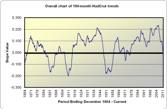
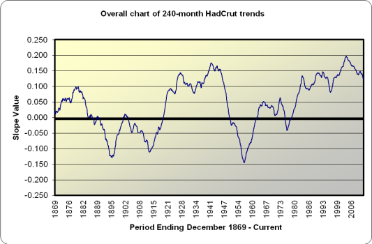
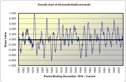
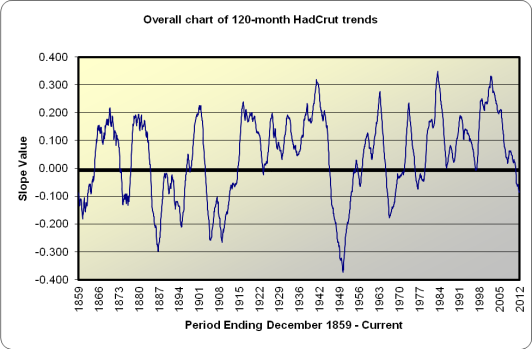
I’ll put these charts up without much comment. I updated them, so I thought I’d post them. Each one represents the historical slope values for the different trend line lenghts (60, 120, …, 360). I just find it interesting to see how the best-fit trend lines adjust over time and compare where we’re at now to historical values.

60-hc-slopes-history

60-hc-slopes-history

120-hc-slopes-history

120-hc-slopes-history

180-hc-slopes-history

180-hc-slopes-history

240-hc-slopes-history

240-hc-slopes-history

300-hc-slopes-history

300-hc-slopes-history

360-hc-slopes-history

360-hc-slopes-history

Posted in Data, Global Warming, HadCrut, Information, Science, Temperature Analysis, Updates | Tagged: , , , , , , , , | Leave a Comment »

Temperature Trends for the last 360 months – HadCrut

Posted by The Diatribe Guy on May 23, 2012

Here are the latest charts for the HadCrut Global Temperature Anomalies, for the 30 year period ending March 2012.

The Data

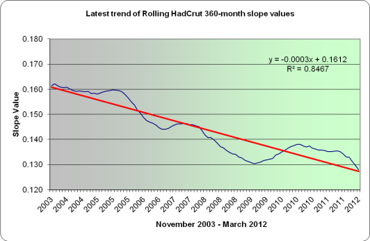
What is presented here is the trend over the last 360 months, the slope of which has been in consistent decline over the last eight years. The current slope itself is +.1279. This puts the longer-term trendline of 30 years at a higher slope level than the 20 or 25 year magnitude. If one were to extrapolate this value forward as an expectation of continued warming, it would represent a 1.53 Celsius temperature increase per century. This spurred the question to me as to what starting point in time to current represents the highest current slope. The answer to that is using a starting point of January 1974 (37 years, 3 months), which has a current slope value of 0.13735. Cherry-picking that data point would indicate warming at a rate of 1.65 degrees Celsius per Century. All trend lines shorter than that (starting at least 4 months ago) or longer than than have a smaller slope value.

Chart below:

30 year Trend - HadCrut

Trend Line over Last 360 months – HadCrut

The next chart is simply a point of comparison. The highest slope value in recent years occurred with the 30-year period ending December 2003, at the height of global warming hysteria.

Recent Peak trend line

Peak 360 Month Trend Line

Finally, I show what has transpired with the slopes in recent years with the 30 year trend line. There has been a consistent decline in the slopes since November 2003 of the best-fitted lines. The decline itself is a very close linear fit though not quite as tight as some of the previous charts. There are periods of deceleration and acceleration in the trend, and even some periods where the slope value increases a bit for a time. Similar to the 25-year chart, in the most recent few months you can see it accelerate in its declining value. There is little indication that this decline will halt in the near term. I should explain how I arrive at that statement. I have a spreadsheet set up to emulate future periods, so by simply typing in prospective anomaly values, I can see what the level of the number needs to be in order to put an end to the declining slope values.

By way of exercise, here are the anomaly values needed to keep the slope the same from the current value to some period in the near future:
1) For the slope to remain level as of April 2012 month end, the next anomaly value has to be 52.
2) For the slope to remain level from April to May, the May anomaly needs to be 51.
3) For the slope to remain level from May to June, the June anomaly needs to be 60.
4) For the slope to remain level from June to July, the July anomaly needs to be 57.

None of these values are impossible. However, given the fact that last 20 anomaly readings are under 50, it would seem unlikely to expect such a series of values suddenly emerge.

Trend in recent 360-month slopes

Trend in recent 360-month slopes

Posted in Data, Global Warming, HadCrut, Information, Science, Temperature Analysis, Updates | Tagged: , , , , , , , , | Leave a Comment »

Temperature Trends for the last 300 months – HadCrut

Posted by The Diatribe Guy on May 22, 2012

Here are the latest charts for the HadCrut Global Temperature Anomalies, for the 25 year period ending March 2012.

The Data

What is presented here is the trend over the last 300 months, the slope of which has been in very consistent decline over the last five years. The current slope itself is +.113 (actually a bit less than the 20 year slope). So, at this point, the 25-year trend is still positive

Chart below:

25 year Trend - HadCrut

Trend Line over Last 300 months – HadCrut

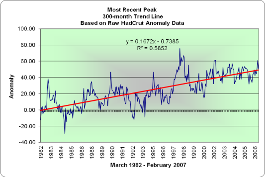
The next chart is simply a point of comparison. The highest slope value in recent years occurred with the 25-year period ending February 2007.

Recent Peak trend line

Peak 300 Month Trend Line

Finally, I show what has transpired with the slopes in recent years with the 25 year trend line. There has been a consistent decline in the slopes of the best-fitted lines. The decline itself is a very close linear fit, though in the most recent periods you can see it accelerate in its declining value. There is little indication that this decline will halt in the near term. If I plug the latest 12-month average anomalies the values continue to decline.

Trend in recent 300-month slopes

Trend in recent 300-month slopes

Posted in Data, Global Warming, HadCrut, Information, Science, Temperature Analysis, Updates | Tagged: , , , , , , , , | 2 Comments »

Temperature Trends for the last 240 months – HadCrut

Posted by The Diatribe Guy on May 21, 2012

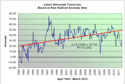
Here are the latest charts for the HadCrut Global Temperature Anomalies, for the 20 year period ending March 2012.

The Data

What is presented here is the trend over the last 240 months, the slope of which has been in very consistent decline over the last eight years. The current slope itself is +.1228. Sp, at this point, the 20-year trend is still positive, even though the last 15 year trend line is slightly negative. This is due to the first five years of the period (1992-97) exhibiting lower anomalies than current averages. That said, the current slope is the lowest value for a 20 year trend line fitted since the period ending June 1998.

Chart below:

20 year Trend - HadCrut

Trend Line over Last 240 months – HadCrut

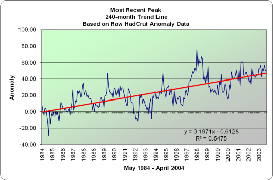
The next chart is simply a point of comparison. The highest slope value in recent years occurred with the 20-year period ending June 2004.

Recent Peak trend line

Peak 240 Month Trend Line

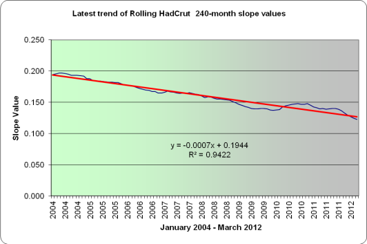
Finally, I show what has transpired with the slopes over the last number of years with the 20 year trend line. There has been a consistent decline in the slopes of the best-fitted lines. The decline itself is a very close linear fit. There is little indication that this decline will halt in the near term. If I plug the latest 12-month average anomalies into each of the next 6 months, we see this trend line dipping below the 0.10 mark in 6-7 months.

Trend in recent 240-month slopes

Trend in recent 240-month slopes

Posted in Data, Global Warming, HadCrut, Information, Science, Temperature Analysis, Updates | Tagged: , , , , , , , , | Leave a Comment »

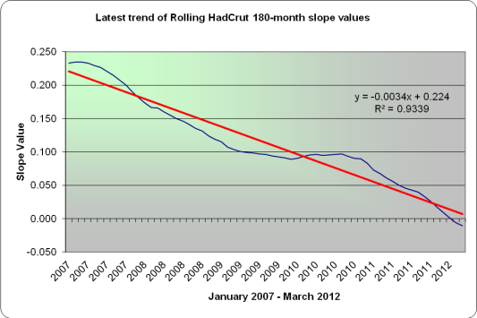
Temperature Trends for the last 180 months – HadCrut

Posted by The Diatribe Guy on May 17, 2012

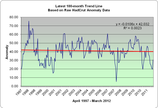
Here are the latest charts for the HadCrut Global Temperature Anomalies, for the 15 year period ending March 2012.

The Data

What is presented here is the trend over the last 180 months, the slope of which has been in very consistent decline over the last five years. The current slope itself is -.0106, and it is the second month in which the trend line is negative. The current slope is the lowest value for a 15 year trend line fitted since February 1977 (back when people were concerned about another ice age).

Chart below:

15 year Trend - HadCrut

Trend Line over Last 180 months – HadCrut

The next chart is simply a point of comparison. The highest slope value in recent years occurred with the 15-year period ending February 2007.

Recent Peak trend line

Peak 180 Month Trend Line

Finally, I show what has transpired with the slopes over the last number of years with the 15 year trend line. There has been a consistent decline in the slopes of the best-fitted lines. The decline itself is a very close linear fit. There is little indication that this decline will halt in the near term. If I plug the latest 12-month average anomalies into each of the next 6 months, we see this trend line dipping below the -0.03 mark.

Trend in recent 180-month slopes

Trend in recent 180-month slopes

Posted in Data, Global Warming, HadCrut, Information, Science, Temperature Analysis, Updates | Tagged: , , , , , , , , | 1 Comment »

Temperature Trends for the last 120 months – HadCrut

Posted by The Diatribe Guy on May 16, 2012

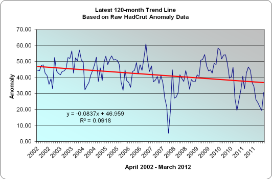
Here are the latest charts for the HadCrut Global Temperature Anomalies, for the 10 year period ending March 2012.

The Data

What is presented here is the trend over the last 120 months, the slope of which has been in very consistent decline over the last decade. The current slope itself is -.083722, which represents a cooling rate of 0.1 degrees per decade. The negative slope of -0.086789 that occurred as of the ten year period ending February 2012 was the steepest negative trend line fitted since May 1969, if my spreadsheet and eyeballs are working correctly!

Chart below:

10 year Trend - HadCrut

Trend Line over Last 120 months – HadCrut

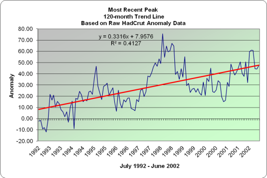
The next chart is simply a point of comparison. The highest slope value in recent years occurred with the 10-year period ending June 2002. The ten year slope does wobble, but not as much as the five year slope does.

Recent Peak trend line

Peak 120 Month Trend Line

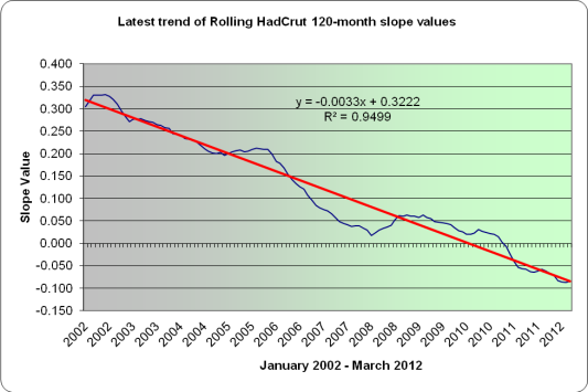
Finally, I just wanted to graphically show what has transpired with the slopes over the last number of years with the ten year trend line. There has been a consistent decline in the best-fitted 10-year trend lines. The decline itself is a very close linear fit. There is little indication that this decline will halt in the near term. If I plug the latest 12-month average anomalies into each of the next 6 months, we see this trend line dipping below the -0.1 mark.

Trend in recent 120-month slopes

Trend in recent 120-month slopes

Posted in Data, Global Warming, HadCrut, Information, Science, Temperature Analysis, Updates | Leave a Comment »