A Look at the Atlantic Multidecadal Oscillation (AMO) Index
Posted by The Diatribe Guy on December 23, 2008
Previously, I took a look at the Pacific Decadal Oscillation (PDO) Index and showed that after a fairly long period of persistence in an average state above zero, it has dipped back down into the negative. It has now been in the negative level enough that the 10-year smoothed chart is actually negative. This has coincided with generally flat to cooling global temperatures, and colder weather patterns in the United States over the last few years.
I also took a look at the ENSO index over timeand showed that, while the ENSO cycle is much shorter-term, it also has been in a persistently warm state since the late 70s. I was one of the first I am aware of to point out the very recent readings in the Index pointing to another La Nina (there is some debate as to whether or not it is a “true” La Nina, since the cooler PDO could be driving this measure down. That seems silly to me. If you’re going to start arguing about influences to the index, then you can’t stop at the PDO.) In any case, the ENSO index is also running into recent negatives, and the persistent warm state appears to have finally come to an end.
It is reasonable, then, to wonder why global temperatures haven’t plummetted. While it is true that, current non-warming trends go back to May 1997, according to UAH anomaly dataand that all temperature measures show a declining trend line since 2001 to one extent or another, we have not been in a freefall on a global basis.
Certain regions appear to be more impacted than otehrs to recent cooler temperatures. The United States and Canada have had a much cooler time of it than Russia, for example. In fact, I previously took a look at the temperature anomaly maps and questioned why Russia seems to show consistently higher anomaliesthan the rest of the globe. I’ve checked the NOAA maps pretty consistently over the last couple years, and I have seen a lot of blue in the United States and Canada, and Russia burns bright red. This appears to be the most significant driver in temperature anomalies not hitting bottom.
It would appear that the PDO and ENSO do not drive Russian anomalies. At least, anyway, not as significantly as they seem to drive our region.
And so I decided to take a closer look at the other Ocean Index data. I have downloaded a boatload of data, and will be getting to each one in time. But I started with the other index we seem to hear a lot about – the AMO index. I started here because from what I understand, this is a pretty key index to keep track of. It also has the longest data history. In full disclosure here, I have not yet taken the time to look at the history of how these temperatures are recorded. I don’t know if they are direct measurements or modeled or some combination of the two. So, I simply present the data as given.
Starting out with the Raw Data:

The overall AMO index data since 1856.
From there, we collapse the data into 5-year average smoothing, which helps show the persistence of the anomalies

The 5-year smoothed AMO index data since 1856.
One step further, 10-year smoothing shows that we have really been in a persistent warm AMO pattern and that the increase in the anomaly has risen with a significant slope:

The 10-year smoothed AMO index data since 1856.
Looking at the above charts, I think each one tells an interesting story. The raw data itself demonstrates a very apparent cycle even without the smoothing. In some ways, smoothing almost hides it. An interesting thing about this index is that the magnitude of the swings are not nearly as large as the PDO index. The scale on the PDO chart was from -4.0 to +4.0. The index on the AMO is a range of -0.60 to +0.80. This tighter band illustrates a little better the absolute cyclical nature of this index.
Simply eye-balling the first chart shows that we are probably at the 3/4 point or so of the current warming part of the cycle. the last cycle had its first crossing of the zero state in 1924 and its final crossing in 1970 before a period falling solely below zero for a few years. The current cycle had its first such crossing in 1980, and seems to have reached a peak. This is the most persistently warm period in the index, with 76 consecutive monthly readings above zero. So, this warm phase of the AMO very likely helps explain why Europe and Russia have not seen the same kind of downturns in temperature as other areas of the globe.
You can really see the persistence of this current warm phase in the 5 and 10 year smoothing. You can see by the charts here that the AMO started its upturn at the same time the PDO crossed into the warm territory.

The overall PDO index data since 1900 with 10-year smoothing.
And now, it would appear that the AMO has reached its peak and is likely about to head downward just as the PDO is crossing into the negative territory. This is the same scenario as 1950, when the AMO started heading south just after its peak and the PDO entered its cool phase. The similarities are quite apparent.
Earlier today I quoted Joe Bastardi in another post. I want to revisit that, from this blog entry of his.
While it has been “chilly” so far, what is about to come is the worst in many a winter, perhaps the sign that the warm AMO is reaching its maturity. The U.S winter has been much like those around 1950 which was the benchmark winter in the Pacific Northwest of the U.S. and was the warning shot that the warm cycle of the ’30s, ’40s and ’50s was starting its end game. It should be comforting to people worried that we are pushing our planet over the edge that things that happened before are happening again, though the discomfort caused by cold is a big problem.
He references 1950, and he references the maturity of the AMO. Clearly, he is already in tune with the AMO phases and, I suspect, the PDO phases. The concurring charts of today look very similar to 1950, and so I do not think his comparison is unfounded. And if the phases of these two indices last as long as previous cycles, then we have a rough 10-15 years ahead of us.
Another point of interest is with the similarity of today’s sunspot activity with the period of the 1950s. In my previous post, Fun Stats With Sunspots and How They Stack Up Against Recent History I made the following observations:
*2-month average = 0.8: The previous 2-month average was 0.5, but prior to that the last time we’ve had a 2-month average this low was the period ending June 1954.
*3-month average = 0.7: This is the lowest three-month average since the period ending October 1913.
*6-month average = 1.8: The lowest 6-month average since the period ending December 1913.
*12-month average = 3.2: The lowest 12-month average since the period ending March 1934.
*2-year average = 6.7: The lowest since the period ending April 1924.
*3-year average = 10.2: The lowest since the period ending July 1935.
*4-year average = 15.9: The lowest since the period ending December 1935.
*5-year average = 22.0: The lowest since the period ending July 1936.
*6-year average = 30.2: The lowest since the period ending February 1937.
No matter how you look at the sunspot activity, we simply have not seen inactivity like we are seeing today since at least 1954, and earlier according to other average measures. However, unlike the PDO and AMO shifts looking like they did in 1950, there is a difference in the solar activity. In 1950, the sun was ending a period of lower activity and longer cycles, and the next half-century gave us higher activity and shorter cycles.
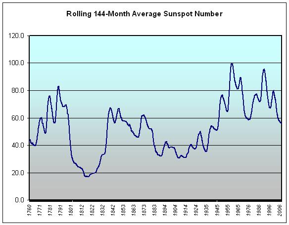
This may have helped counter the impact of the PDO and AMO cold phases of the next 20-30 years. That solar activity continued throough the warm phases of the AMO and PDO. Unlike that period, it appears that we are entering a cold phase of the PDO and a downturn of the AMO just as we did in 1950, but we are doing it at the beginning of a less active sun. Of course, we don’t know if the sun will stay this way, but history seems to indicate that we can expect it. For more information on that, click on my “Landscheidt” category.
I don’t want to be glib about this. I’m not wringing my hands in fear, nor am I gleeful at the thought of cooling, even if it shows the folly of the global warming alarmism that I despise. And while I don’t pretend to know all the ins and outs of climatology, I can look at charts and data. Sometimes the simplest answer really is the best one. Look at the charts. They explain the warming since the 1970s. They explain the last 10 years being flat. They explain why we’ve cooled and Europe/Russia haven’t. They explain why they too will soon will be cooling. They explain why this will likely be more predominant cooling than 60 years ago.
Carbon Dioxide may have some small impact in all of this, but it simply does not effectively explain near as much as all these other elements do.

Alec DesRoches said
Lame-man here…who has been curious about AMO over the last few days.
AMO has been dipping:
Sept: 0.252
Oct: 0.154
Nov: 0.055
http://www.cdc.noaa.gov/Correlation/amon.us.long.data
Layman Lurker said
Joe, check out Pielke Sr’s blog at “Cimate Science” if you have not done so: http://climatesci.org/category/guest-editor-weblogs/
Once you are there check out “climate change metrics”. Much of these posts deal with Pielke’s view that the ocean (not the atmosphere)is the key metric to truly understand radiative imbalance. The oceans have much more heat absorbing capacity than the atmosphere. Not only that, but (I believe) mechanisms of forcing like solar radiation have a much greater affect on oceans than atmosphere. It would seem that any change or cycles in solar radiation over decades for example could have a potentially large impact on warming and cooling of oceans. Furthermore, transfer of heat from a warming atmosphere (AGW?)to ocean through infra red radiation is small by comparison. Solar radiation would have to be an almost constant equilibrium state for the entire change in ocean heat to come from a warming atmosphere via infra red.
The Diatribe Guy said
Thank for the link. I’ll check it out when I can (probably after the holidays).
Nils, G said
I have also been looking at AMO plots against detrended CRU temperatures and normalized weather station measurements from around the Arctic Circle. Both show high correlation between temperature and AMO from 1900 until present. What is puzzling to me is that the AMO temperature change FOLLOWs CRU and Arctic station temperature change. Anyone have an explanation.
Also, since the AMO history goes back 300+ years, one must assume global temperature must have been oscillating too before AGW.
Layman Lurker said
Nils, G have you seen Bill Illis’s post at WUWT from two or three weeks ago? He finds correlations between global temperture and ENSO / AMO and attributes the residual trend to CO2.
RC had a post on Dec 16 called “2008 temperature summaries and spin”. Gavin responded to comment #66 (exerpt):
“There are some analyses that are worse than others though – for instance using a trend+AMO to match the N. Hemisphere temperatures is simply correlating the temperature with itself. Not much predictability there.”
I think he implies that global or regional temperature trends drive the AMO and therefore would likely feel that Bill Illis has causality reversed. Need to do a bit of searching on this to find out more.
Layman Lurker said
re: #5 my comment above:
Doing some checking to interpret Gavin’s comment I cited above. I believe he is talking about the fact that monthly mean global average SST anomalies are removed from ocean temperature data.
Nils G said
Layman, thank you for your reply. I am new to this web site, so forgive me for not knowing how to find your references. Let me explain my question a little more clearly (I hope).
I carefully found fifteen weather stations around the Arctic Rim which were above or very near to the Arctic Circle, spanned the whole Arctic Rim, and had near continuous weather records going back as far as 1900 or the 20s and 30s. I normalized their temperatures onto the range 0-1 based upon their maximums and minimums and averaged the normalized values over all stations. This gave me a good indication of the temperature trend over the time spam 1900-present.
I plotted this trend against the AMO temperatures and found a strong correlation which was not surprising. The station temperatures 1910-1940 and 1970-present increased as expected. What I didn’t expect was that the station temperatures increased about 15 years BEFORE the AMO.
It seems to me that something is driving both the station temperature and the ocean temperature, and the ocean temperature is lagging since the ocean takes longer to warm up.
Regards, Nils
Layman Lurker said
Nils, I am not a scientist so take that for what it is worth. Here is some speculation. The artic is one of the prime areas of the feedback mechanisms of global warming – where warming (or cooling) trends are amplified by albedo changes. Increasing artic temperatures would correspond with decreasing polar ice. This in turn would decrease albedo and allow greater capture of solar radiation in the arctic ocean, which would in turn cause ocean warming.
Until your post, I was not aware of any lagged correlation between arctic temps and AMO (not to say none has been observed). If the lag is true an interesting follow up would be to include arctic ice anomalies in the analysis to see how it fits in.
I am aware of correlations of AMO with global temps but the to my knowledge global temp correlation does not lag AMO. Maybe Joe knows something. Another interesting angle would be to examine your arctic temp data with the rest of the global temp data (excluding arctic temps) to see if there are any lags.
Layman Lurker said
oops. I said: “to my knowledge global temp correlation does not lag AMO”.
It should be: “to my knowledge AMO does not lag global temp”.
The Diatribe Guy said
Thanks for all the comments. Excuse the absence… I was off visiting family the last three days. Those “old school” parents of mine aren’t even online!
I do not specifically have anything I can speak to with regard to the lag between AMO and artic anomalies, but if I look at the relationship of the PDO cycle and the AMO, the phases look to be offset, but of similar overall length. Perhaps it is the case that the PDO and other oceanic oscillation cycles are the drivers in the Arctic, and the lagged correlation seen with the AMO is more a mechanism of the AMO’s relationship with those other oscillation cycles.
This is conjecture at the moment. But I have downloaded all the different index data and plan on looking at each one individually. I hope to do a correlation analysis at some point between all of them to see if I can isolate each one’s contribution to global temperature, and wouldn’t mind doing the same thing on a regional basis.
But we’ll have to see if and when I have time for all that.
CookevilleWeatherGuy said
Very interesting blog…I’ll put it on my list of ones to read!
Bill Illis said
gavin’s comments regarding the AMO are partly correct.
The AMO region represents about 5.5% of the globe (probably less compared to the regions which are actually counted in the global temperature record since Hadcrut3 and GISS don’t use the whole AMO region in their global temperature record.)
So one is using (up to) 5.5% of the dataset to predict 100% of the dataset.
The Nino 3.4 region as well represents about 0.7% of the globe and is fully counted in the global temp record. But the correlation for Nina 3.4 is lagged 3 months so one is using 0.7% of the temperature record of 3 months ago to predict today’s temperature record.
Gavin is, thus, only partly correct and is ignoring something very important. If 5% of the globe and 0.7% of the record of 3 months ago, can predict up to 70% of the temperature variation, then it is certainly something worth looking at.
In addition, these two indices are natural cycles of the climate: they are not related to global warming. Even Michael Mann and Jeff Knight (a realclimate contributor) wrote a major paper several years ago about the AMO and concluded it was natural climate cycle, unrelated to global warming, and it contributed significantly to global temperature variation.
Click to access KnightetalGRL05.pdf
AMO reconstructions going back to the 1500s show the AMO has less predictable cycles over time than the most recent AMO index makes it look like and it further indicates it is a natural climate cycle unrelated to global warming.
There is one thing about the AMO that people should recognize. All of the oceans have been increasing in temperature over the past 100 years, somewhere around 0.3C. The AMO region has been increasing as well. The index we use has been detrended to remove this increase over time so that the increase in the trend is left to global warming.
Here is the Raw trended AMO index (the scale makes the increase look bigger than it really is.)
But the AMO is the most significant natural ocean cycle in terms of affecting global temps. The AMO provides a +/-0.3C to the monthly global temp anomaly. The Nino 3.4 region, lagged three months, provides only +/-0.2C.
And there are 3 very active ocean regions which are exchanging energy with the atmosphere. The AMO (and the gulf stream), the ENSO region and the southern hemisphere’s counterpart to the AMO (which I have been calling the Southern Atlantic Multidecadal Oscillation – SAMO.) The AMO and the SAMO are the downwelling areas where the once warm surface ocean water, cools and sinks to become part of the deep ocean circulation – they are the sinking points of the Thermohaline Ocean Circulation. The ENSO is the equatorial region which is most active in energy exchange between warm equatorial ocean water and the cooler layers right below and the atmosphere.
This is why these ocean indices are important to the variation in global temperatures.
Here are my latest temperature reconstructions for global temperatures, the tropics, the northern hemisphere and the southern hemisphere. It is evident why these indices are useful.
The Diatribe Guy said
Bill, thanks for the comments. They are interesting and helpful to putting all this in context.
I am planning on doing my own correlation analysis at some point on all these indices. It will be interesting to see whether or not the results will be similar.
Layman Lurker – I finally had a chance to check out the climatesci.org link. There’s a lot of good material there. I have made a note to add that to my blogroll.
Layman Lurker said
#12 Bill Illis
Thanks for your response. I found your analysis at WUWT to be a very interesting read. It seems very obvious that Gavin’s comment was directed at least partially to your post. I take it that you would interpret the remark to mean then that temps cause AMO rather than reverse? You mentioned temperature reconstructions for NH, SH, and tropics…do you have any opinion on possible lagged correlattion (AMO lagging) with artic temps (see Nils G posts #4 and #7 above).
I am intrigued by the oceans and global warming. Since the oceans have a far greater heat absorbtion and retention capacity than the atmosphere, I have wondered whether the oceans are treated as to much of a sideline in the climate debate and should have more of the focus. It seems logical to me also that things like solar radiation would behave much differently with ocean warming than with atmosphere. For example, might there be situations where clouds are positive feedback for atmosphere but negative for oceans? In my mind the cause of the radiative imbalance expressed in ocean warming is one of the critical areas which needs to be better understood.
#13 Diatribe Guy. Good to here. Your site is a great resource. Looking forward to your posts of temp correlations. It would be great to have Bill back to join in the discussion when the time comes.
Joe, Bill, Happy New Year and thanks for your hard work in helping a layman like me understand things a bit better.
Stephen Wilde said
I have been publishing a series of articles on just this topic since April 2008.
One can be found here:
http://co2sceptics.com/news.php?id=1302
Layman Lurker said
#15
Thanks for the link. Your topic deals with a lot of the questions which I have.
Mike D said
Bill:
You are apperantly leaving a few areas out of the picture that might have a slight something to do with global temp. If you belive in such a thing. You did not mention Thermohalene, NAO, AO, SOI, Well I dont remember all the names but there is one in the Indian Ocean. One around the south pole ocean. there are others oscellations I have read about but they may be subsets of the major ones as they are subsets of the thermohalene oceanic circulation. Also most of the O’s are related to atmosphere circulations. One last point. There is no known accurate global temperature records that have not been adjusted for some theory or another. You can find raw data for rural areas and that is the closest you will find. The measurements for sea temp are FUBAR older than sat. records.
Mike Davis said
P.S. Although I trust the satillite records more than surface records. I understand there problems with those as well. I feel the main difference is this: Those doing satillite are working to find errors in the data and those doing surface appear to be constantly adjusting data to prove a theory.
matt v. said
diatribe guy
Excellent web page.
Do you have the AMO INDEX based on annual average figures?
Alec DesRoches, a.k.a Daffy Duck said
Atlantic Multidecadal Oscillation dipped just into negative territory, -.007, in January…
Feb number hasn’t been posted but it should be cooler than January!
http://www.cdc.noaa.gov/data/correlation/amon.us.long.data
The Diatribe Guy said
Very interesting. That’s the first negative anomaly in the AMO since 2002. Based on where that cycle is at in the sinusoidal wave, that’s quite a departure. It will be interesting to see if there’s any persistence to that.
Alec DesRoches, a.k.a Daffy Duck said
TO: The Diatribe Guy
Hmmm…Lack of Sunspots???
Back in December I looked at Spotless years, then added ~2years as it might take awhile for the oceans to show effect, then I looked at the graphs of PDO an AMO….it seems that PDO and AMO spike negative/and don’t spike positive after [major] spotless years.
Spotless years graph

pdo data
http://jisao.washington.edu/pdo/PDO.latest
pdo graph
http://jisao.washington.edu/pdo/
amo data
http://www.cdc.noaa.gov/Correlation/amon.us.long.data
AMO graph

http://solarcycle24com.proboards106.com/index.cgi?board=globalwarming&action=display&thread=319
Hmmm, had I made a prediction back in December it would have been AMO spiking negative fall 2009- winter 2010.
Alec DesRoches, a.k.a Daffy Duck said
AMO dipped in February to -0.113
http://www.cdc.noaa.gov/data/correlation/amon.us.long.data
AMO has not been that low since 1994 when it switched from cool phase to warm phase.
PDO was at -0.155 for feb
john said
‘Look at the charts. They explain the warming since the 1970s. They explain the last 10 years being flat. They explain why we’ve cooled and Europe/Russia haven’t. They explain why they too will soon will be cooling.’
I wonder if the current weather in Europe means that they too have
finally cooled.