May 2009 Sunspot Update – Fun Facts / Cool Outlook
Posted by The Diatribe Guy on May 13, 2009
We continue to see a quiet sun. I know there is a lot of debate about whether it’s truly “unusual” activity, or whether it means anything at all to temperature and climate. I honestly don’t know the answer to the second. From what I understand, the theory is that a quiet sun means that solar flares and other wild activity are not there to hamper cosmic rays from pelting the earth. (As an aside, whenever I hear things like “Cosmic Rays” it takes me back to my youth, where different space ray exposure meant you would be turned int a Super Hero. So, maybe one byproduct of a quiet sun will be people who can fly, or are really flexible, or who can turn invisible. Let’s just pray they don’t turn into orange, rock-like monstrosities strong enough to lift tanker-trucks into the air).
What was I saying? Oh, yeah… Cosmic Rays. Anyway, unimpeded rays apparently stir up more evaporation, elevating the level of water vapor, elevating cloud cover, elevating rain… eventually, between clouds blocking the sun and the rains cooling the land, we get cooler temperatures.
There have been some correlation analysis done that linked the length of solar cycles to changes in temperature. These, as far as I can tell, have been fairly simple and, while compelling, have limited data points. So, it’s interesting as far as it goes.
I’ve done a similar exercise, but by looking at the full set of data as it relates to lags, using a minimization of least squares simultaneous approach. I have updated that study and will present it here. In addition, I’ll throw out the latest observations on how current data trends in sunspot counts stack up to history.
Before I begin with that, I need to throw out a caveat that was rightly pointed out to me in a previous post I made regarding the sunspot numbers: if you go to the NOAA Sunspot data, which is the source I am using (linked to the right), you will see a statement at the bottom of the page that tells you that the data after such and such a month (about 6 months ago, depending on when you’re checking) is preliminary. That is because the traditional way of counting sunspots incorporates formulas that, today, don’t seem to make a whole lot of sense. You might think that the count is the count, but it’s not quite that simple. The count itself is a formula, based on number of days of observation adjusted for a formula to account for the other side of the sun, clusters, etc. Then, after that, the monthly average count is adjusted for an annual average. It can all be pretty confusing, and at one time I could rattle off all the details, but it’s been a while since I refreshed my memory on it, and quite honestly I’m admitting to laziness by not digging into it at the moment. The important thing to realize is that the last few months could see adjustments to the numbers over the coming months, but I will treat them for presentation purposes as “the number.” The reasons for these adjustments, I believe, have more to do with maintaining consistency in the method so that we can compare a reading today to a reading 200 years ago. We can argue about differences in technology affecting that, but at least the determination of the count number is consistent.
OK, so on to some data tidbits:
In each of the last five months, the sunspot count is preliminarily showing values of 1.5 or less in each month. The last time we saw a consecutive 5-month stretch like that was the period ending September 1913. Yes, that’s over 95 years ago.
The latest count = 1.2. The two-month average = 1.0, and the three month average = 1.1. While very low by historical levels, we did see similar 2-3 month averages in 2008.

Sunspot counts since 1850.
I took a look at the following averages, all of which are the lowest averages since similar periods ending in 1914-1915: 6-month (1.6), 12-month (1.8), 24-month (3.9), 36-month (7.0). So, any way you slice it, the sun in the last three years is unlike anything most of us have seen in our lifetimes. Does it mean anything? I don’t know for sure, but it’s still an interesting phenomenon.
Here are a couple of those charts, for your entertainment:

12-month rolling average sunspot counts since 1850.

36-month rolling average sunspot counts since 1850.
Then, I took a look at averages that are the lowest since the mid 1930s: 48-month (11.7), 60-month (16.4), 72-month (23.2), 84-month (32.4), 96-month (42.7). So, the last 4-8 years is in territory not seen in over 70 years.
Again, let us look at one of these pretty charts…

60-month rolling average sunspot counts since 1850.
The 108-month average (50.6) and the 120-month average (56.6) are at levels last seen in 1978:

120-month rolling average sunspot counts since 1850.
Finally, the 132-month (57.9) and 144-month (55.8) averages are at levels last seen in 1946 – over 60 years ago.

144-month rolling average sunspot counts since 1850.
For the pure sport of watching the data, these are exciting times. For the intrigue in finding out first-hand whether or not an extreme low relative to current history has an impact, they are interesting times. I don’t use the word “exciting” because I am simply not of the mindset that a cooling globe is a favorable thing. If the theory that links extended solar inactivity to lower temperatures has merit, then that is what is in store for us, and I don’t particularly like the idea.
So, my own contribution to determining whether or not there is any merit to that is to take a look at the different lengths within a solar cycle as well as sunspot count levels and do a correlation to temperature. I use HadCrut, since we have readings for that back to 1850. I explain the methodology more fully here, and won’t repeat myself in this post.
The first chart demonstrates the correlation (and I call it influence, since there would be no reason to believe that our temperature could actually cause differences in solar cycle length or sunspot count) between the length of time elapsed from the beginning of the most recent minimum and change in temperature:

I think the key to understanding this result is to take a look at the shape of a typical cycle. Since the last fully completed cycle is Cycle 22, let’s look at that one:

The solar cycle ramps up to a peak fairly quickly. Estimates I’ve seen for the typical peak tend to put it at a Fibonacci level of 38.2% into the cycle, on average. Notice here that I use the 12-month average. This is NOT the official way of stating cycle length, but in order to formulize it consistently, my own convention for determining the min/max of the cycles was based on the 12-month average sunspot count. Nitpick away, but the results shouldn’t be dramatically affected by using a different convention.
As a point of interest, the above cycle using this convention starts March 1987, the peak is January 1990, and the cycle ends October 1996. Total length is 116 months. The max occurred at 35 months. 35/116 = 30.2%. So, Cycle 22 seemed to peak a bit early, but you see the general correspondence.
Now, let’s get back to the bar chart. If it is true that temperature lags count, then we would expect temperatures to rise later in the cycle, rather than earlier. The chart may well be displaying this characteristic. The earlier periods (0-24 months) reflect the period from the previous cycle of lower sunspot activity. The period between 30 and 78 months corresponds rouoghly to when maximums occur, but the temperature is probably reflective of the ramp-up period to solar maximum, which shows average to slightly elevated temperature. In the lengths 84+, we see the impact from the maximum that occurred anywhere from 3-7 years prior. This chart doesn’t really get to the question of the effect of cycle length on temperature, then, because of the lag in influence on temperature.
This prompted me to put the following chart together:

Now we’re talking…
This represents the length of time since the minimum of the previous cycle once a new cycle has begun. This isn’t a perfect chart, but it does help sort some things out. For example, the left side starts below 120, which means that, by default, the previous cycle was short, since the new cycle has already begun less than 120 days after the beginning of the previous one. Temperature is very much influenced positively in this area of the chart. Likewise, the right hand side of the chart shows negative temperatures starting at around 245 days, and getting much cooler towards 270+ days. Clearly, the only way to get to day 270+ is to have consecutive longer cycles. So, we can look at these two sides of the chart and form some reasonable conclusions: there is an influence of solar activity on temperature; the influence on temperature lags the activity/inactivity that influences temperature by a period of some years.
Further, keep in mind that the influence on temperature in these charts represents a change in temperature, and not a deviation from average. So, it stands to reason that consecutive short cycles will warm temperatures above average, and then drive up temperatures some level above that already elevated average. Consecutive long cycles would do the opposite.
The part of the chart that is a little mushy is the middle part, because that could be any combination of cycle lengths at different points within the cycle. The more important parts are the left and right sides.
I did the same thing from Maximum to Maximum. Due to the already lengthy nature of this post, I won’t post those. You can see the ones I did last year on the post I linked to earlier. The same logical conclusions follow.
So, cycle length is one thing, and it’s clear, then, that solar activity must influence temperature. So at what level does solar activity seem to affect temperature?
The following chart is interesting:

According to this, there’s actually an inverse relationship between counts and temperature influence! What gives? How is this consistent with positive temperature deviations following solar maximums?
The key word is “following.”
It seems very apparent that there is a lag in the influence of solar activity on temperature. Thus, the current 12-month period really doesn’t have much to do with the current temperature. I believe all this chart shows is that during periods of low solar activity, there is higher temperatures due to the lag effect from the previous high activity. Likewise, at solar maximum levels of very high activity, we are seeing the influence on temperature from previous low activity.
Now, let’s look at the next two charts:

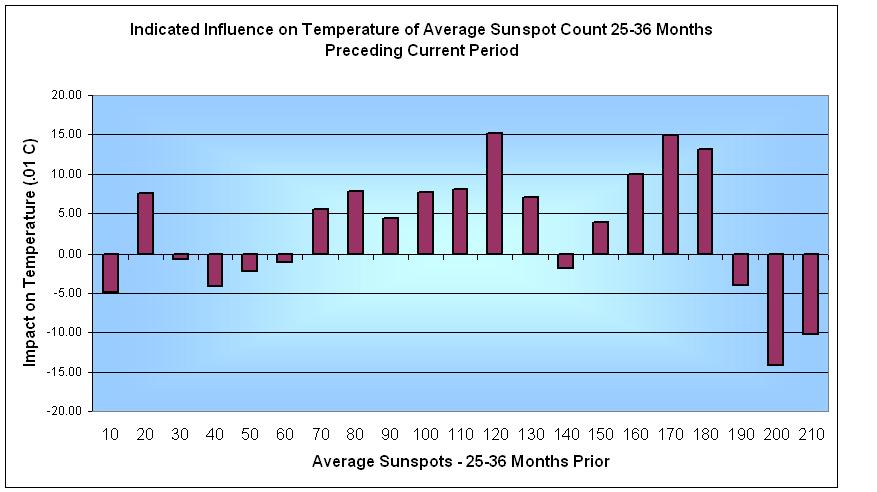
These are interesting, as well. The first one is very clear. Sunspot activity from 13-24 months prior influences temperature. Once you reach a level of 160 or so, there doesn’t seem to be much more influence on temps. Anything at a level of 100 or above positively influences temperature, and everything below 100 negatively influences it, though not to the same extent. On average, the longer period of low activity, then, looks to balance the shorter periods of high activity. This balance gets off-kilter with successive shorter or successive longer cycles.
So, there is a clear 1.5-ish year lag (am I allowed to use “clear” and “ish” in the same sentence?) And since the cycle can spend 3-5 years in the 100+ category, then the influence ramps up to a measurable increase in temperature. We can see that the lower levels will bring about cooler temps, but at a slower pace. So, if the next cycle starts early, we’re starting at an elevated level and warming up more from there. This, in my opinion, has clearly happened over the last few decades. The current long cycle 23 is only now getting to the area where the temperature influence on the cooler side should become more noticeable. But we won’t see noticeably cooler temperatures unless Cycle 24 cooperates, so to speak. If the maximum does not reach 100, then it will not induce a warming effect, regardless of cycle length. However, a longer cycle also delays the possibility of warming from the Cycle 25 maximum, as well, so if Cycle 24 is weak, I predict we will see a noticeable temperature decline as a result. But it will not be immediate. Each year builds from the previous year’s point, and it will be a cumulative effect.
As for the 25-36 month chart, I put it up as a point of interest, but the results are mixed. It appears that, of the three, the best lag is 1.5 years. Now, I suppose I could optimize the best 12-month average and find out that it’s really 1.75 years, or 2 years. But what I know is that the 1.5 year average lag correlates better than the 0.5 or 2.5. The true optimum value may well be something else.
The exact number isn’t as important as the conclusion: The last point in which the 12-month average sunspot count was at least 100 was January 2003. The temperature then, isn’t really influenced much one way or another until the count gets below 60. That point occurred March 2004. If temperature lags by about 18 months, and the chart shows about 0.1 degrees change per year influence, then we would see the initial indications of actual cooling starting in 2006. 0.1 degrees Celsius over a couple years is not enough, with the variability of global temps, to draw any firm conclusions. And this decrease may well be offset by some other factors. But if the next solar cycle has a very low maximum, then we’re looking at a 15-20 year period of temperatures declining at 0.1 degrees Celsius per year. That will be noticed.

TMLutas said
I can assure you that cosmic rays still cause super powers. Just ask my son. He wants some.
Fluffy Clouds (Tim L) said
LOL, yes it will!
if the next solar cycle has a very low maximum, then we’re looking at a 15-20 year period of temperatures declining at 0.1 degrees Celsius per year. That will be noticed.
Tenuc said
Good stuff – I wonder why other scientists haven’t published similar conclusions???
A drop or c2 degrees is worrying, but I fear the rate of temperature drop will increase over time, as fresh snow precipitation and new ice increase the albedo of the earth. This seems to be what happened during the Maunder minimum.
I hope my view is wrong, as a mini-ice age is the last thing this world of ours needs in the middle of a financial depression…
June 2009 Update on Global Temperature – UAH « Digital Diatribes said
[…] Global (and Regional) Temperature – RSSA Look at the Atlantic Multidecadal Oscillation (AMO) IndexMay 2009 Sunspot Update – Fun Facts / Cool OutlookHow Not to Remove a Wood TickPacific Decadal Oscillation (PDO) Index – Back into the NegativeSunspot […]
Mark Baker said
Did you notice that from 1794 – 1829 the 12 month average of sunspots never went above 60? Right now we are at 69 consecutive months under 60, only 30 years more to go to tie that record.
The Best of Digital Diatribes (In one man’s opinion…) « Digital Diatribes said
[…] So, with that introduction, here they are: (1) Sunspot study that derives a correlation between sunspots and temperature […]
The Norlonto Review said
[…] more important to global temperatures than any human activity short of a total nuclear war. This posting looks at the data in some […]
Yaşanmış Komik Olaylar said
Bu günün çişini yarına bırakma Gülme komşuna dayak yersin Korkunun ecele faydası yoktur, ama çamaşırları pisletir Vakitsiz öten horozu, tamirciye götürmek gerekir. Denize düşen, yüzme bilmiyorsa…devamı için: http://www.komikti.com/viewer.asp?ino=191